Table des matières
Construction of the message
Prefer to work in percentage rather than pixel.
When you have to center a text or an image, it is better to insert the column tool, with the creation of three columns (which will be in percentages) rather than inserting only an image, for example, and center it thanks to the margins (which will be in pixels).
Thus, when your message is displayed on a mobile device, the spacing will not be fixed and will adapt to the device, unlike pixels.
 ( in pixel)
 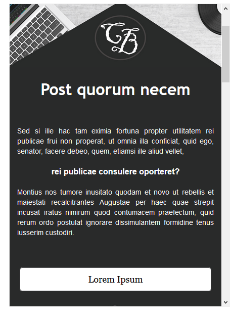 (in %)
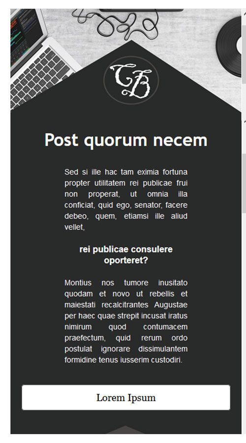
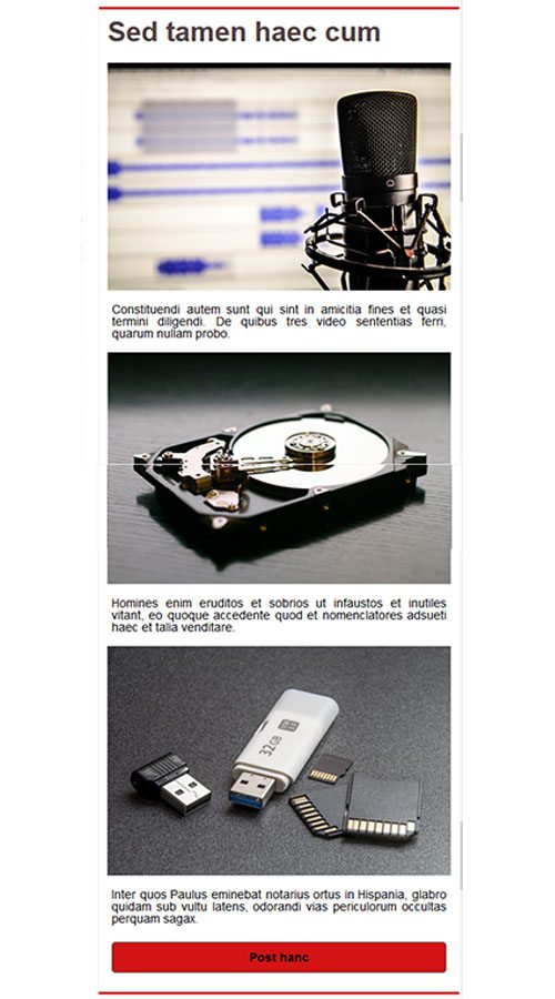
Mobile display
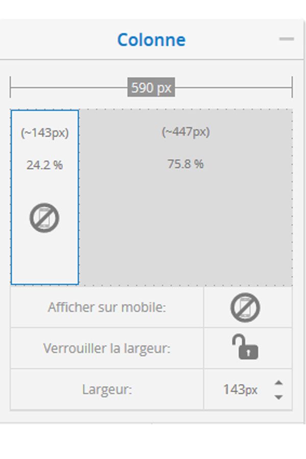
Parameter of the "columns" tool
- When you insert the "multiple columns" tool in a container, you can choose to display or not some columns when your message is opened on mobile.
To do this, simply click on the column in question (in the right-hand menu) and then click on the "mobile" icon
- You can also choose whether or not to rearrange the columns when the message is played on a tablet or mobile device.
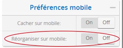
The button is set, by default, on the reorganization on mobile.
But this does not always give an optimal rendering, so you have to force the columns to stay next to each other by pressing "off".
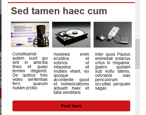
Here is an example:
This post is also available in:
 Français (French)