Message structure
The overall architecture of the responsive message is built in blocks.
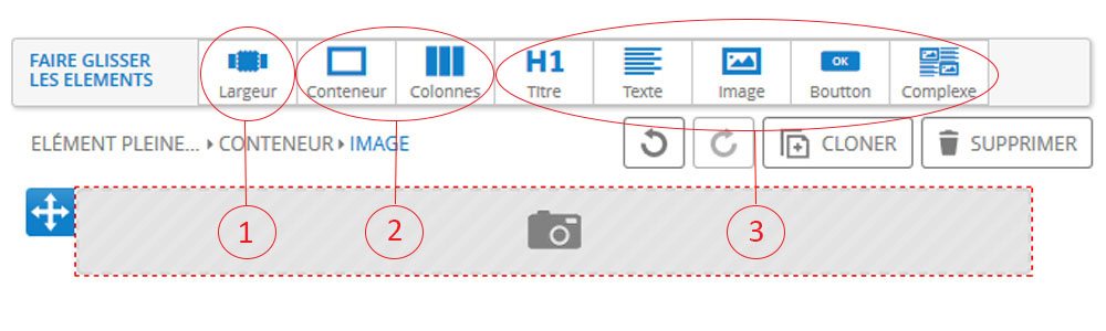
1 - The first element to implement is the "width" tool. The containers will be placed within this width.
This tool allows you to display a colored background on the entire width of the prospect's screen, regardless of its size.
You have the possibility to divide the width in two parts.
2 - Structural elements
The containers define the structure of your message. It is possible to nest several containers.
Ideally, when the message is finished being structured, each sub-container should have only one function.
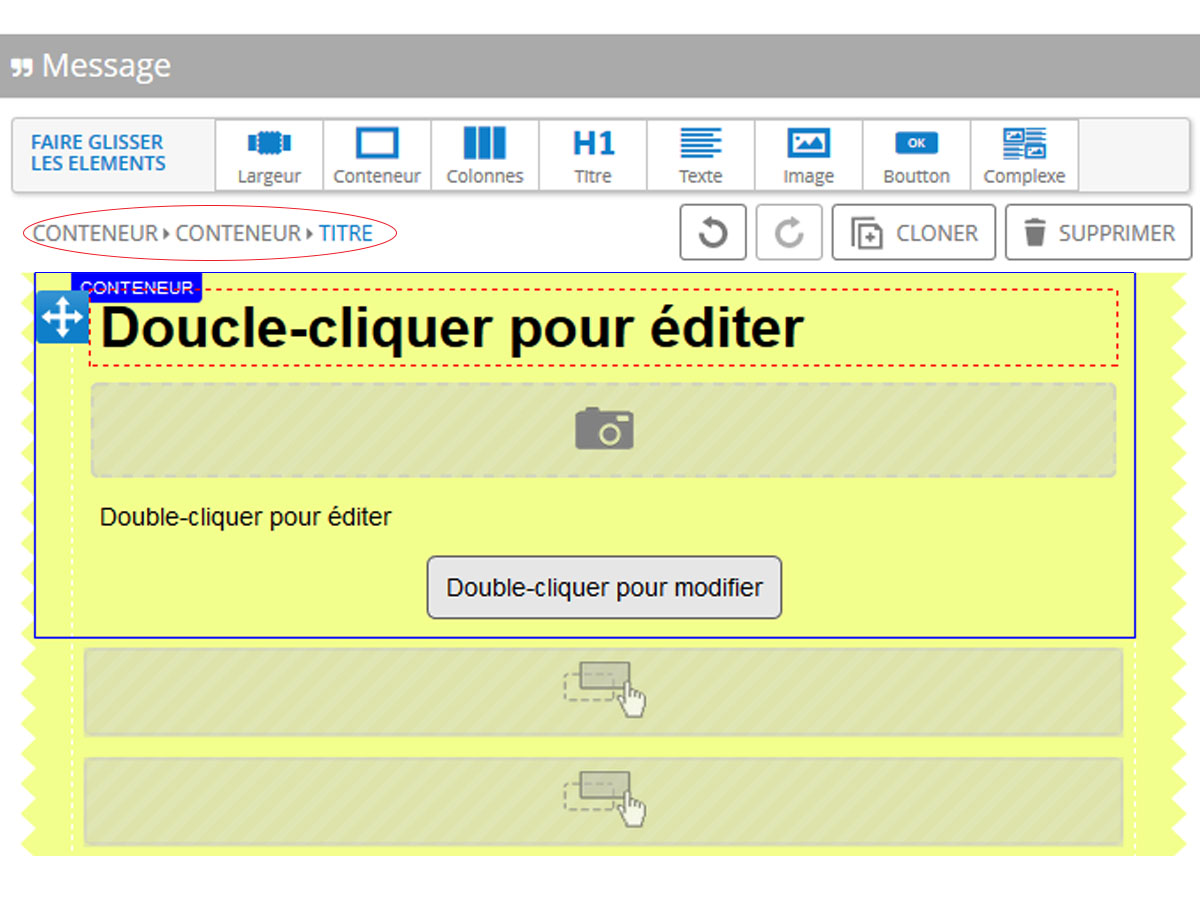 On this example, we find the width (in yellow), a first container (circled in blue), inside which are four containers.
Each of these four containers has a different function, the first is a title, the second an image, the third a text and the last a button.
This is verified by the path (top left, circled here in red), we find the two containers nested and then the title.
The "column" tool is placed inside a container and also allows to structure the email.
3 - Filling elements
These are the tools that will allow you to insert content into your message. So you just have to drag them into the containers and columns.
The "complex" tab works with the "container" and "column" tabs. It allows you to save the content of a column or a container as a complex element to reuse it later in another template. So you can make this record from the right menu of the "columns" and "container" part.
To have more impact...
To improve the visual rendering of your creation and make it more impactful, some parameters can be customized such as spacing and margins, borders or background.
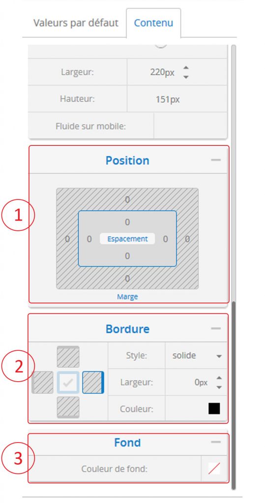
1 - The position of an element in relation to the others can be modified by playing with the margins and spacing.
2 - A border can be added. You can change the aspect (continuous, dotted or dashed), the width and the color.
3 - You can add a solid background color under some elements of your message.
The preview
The preview allows you to test if your message looks good on different media.
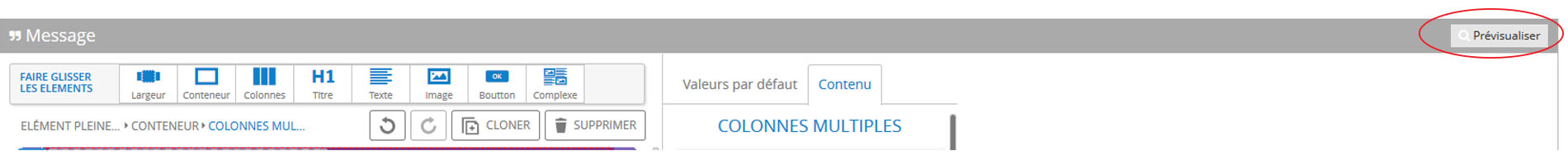
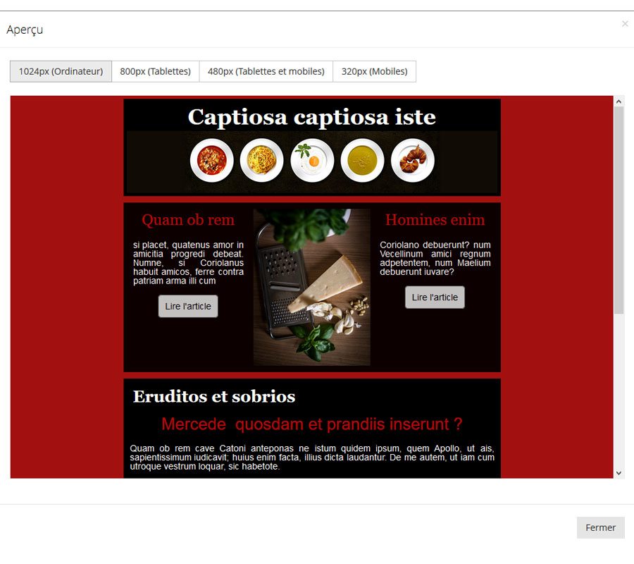
You can see how your emailing will look on computers, tablets and mobiles depending on the screen size.
This post is also available in:
 Français (French)